Public health data is one of the most powerful tools we have for understanding communities, identifying patterns, and informing change. But even the most meaningful data can fall short if it isn’t communicated in a way that people can understand and use. Using data to inform public health decisions has many benefits, but there can be a disconnect between the data that exists and the decisions that need to be made. The problem isn’t always the availability of data, but the ability to understand and use it.
Our client-partners work with data that contains information about the retail environment, including retailer locations, products sold, pricing, and proximity to youth-centered spaces. While this information is important, it’s difficult to advise on policy without a clear understanding of what impact a particular change may have. A spreadsheet filled with data may have a crucial story to tell, but it’s not always easy to see.
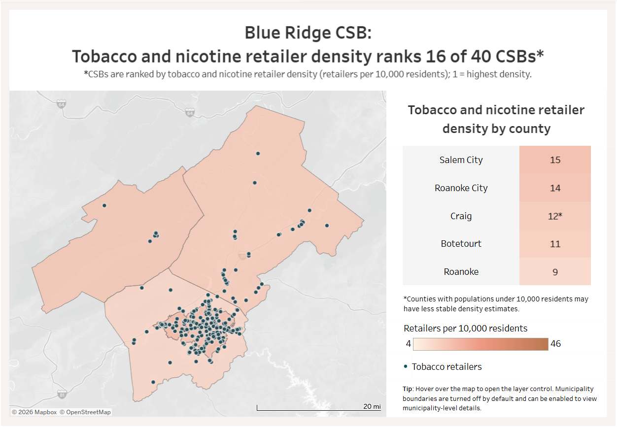
This is where data visualization can help. Data visualization is the process of turning information into visual tools such as maps, graphs, and dashboards. It allows individuals to see beyond the raw numbers and connect with the meaning behind the data. Visuals can help reveal patterns, trends, and disparities that hide in large datasets, helping public health professionals understand the data and the community it represents. For example, a spreadsheet can show the number of retailers in a county, but a map can display where those retailers are located relative to schools, parks, and other places with higher concentrations of youth. A dashboard containing descriptive and context-based visuals lays out data in a way that can help organizations identify the areas where prevention efforts and policy changes are most needed. These visuals help turn dense data into a clearer story.
Storytelling matters in public health. Advocates are looking to explain why an issue deserves attention, funding, and policy action. When data is presented visually, complex challenges become easier to understand and feel more actionable. It also highlights inequities, allowing policymakers to identify communities that may experience greater exposure to harmful products and health disparities. Data visualization strengthens public health expertise, community voices, and advocacy. When data is clear and accessible, it becomes easier to communicate problems, identify solutions, and guide decision-making. Data visualization can support community members in actively participating in community change work and helping shape the solutions that directly impact their lives.
At Counter Tools, we help bridge the gap between data and action by creating high-quality visualizations that allow our client-partners to understand the retail environment in their communities. These insights can support evidence-based strategies and informed policy decisions. Contact Counter Tools to learn more about how you can use data visualization in your education and advocacy efforts.