The COVID-19 pandemic invited technology innovation in order to help keep the public updated, and inform scientists, leaders, and public health departments as information changed rapidly and more people were affected. Health departments working with academia and the private sector built useful tools to share information and guide responses to the pandemic. Existing health disparities and access to services were exacerbated as some communities were hit harder, and demographic data were utilized as the public health world sought ways to address these challenges.
There were some grand ideas touted by the tech world at the start of the pandemic, such as the promise of a Google-powered site where anyone in the U.S. could find a place to get a test. A testing system was piloted by Verily, but was eventually phased out over concerns about patient data and accessibility to low-income groups. Tech companies built some helpful tools like Google’s Community Mobility Reports, apps that monitored social distancing, and large-scale data crunching websites, but these were not incorporated into existing public health systems. It became clear that new tech needed to be partnered with guidance on how communities should interpret and use the data, and how communities would be supported by social systems when risk levels are high and daily life is affected.
With the endemic spread of COVID-19, data dashboards became popular as a way to share data about cases, tests, hospitalizations, deaths, and eventually vaccinations. The democratized data was used to support community organizations, health advocates, hospitals, physicians, public health officials and policymakers as they responded to the pandemic. The Johns Hopkins Coronavirus Resource Center (CRC) quickly became a leading resource used by public health policymakers and major news outlets around the world and continues to be two years later.
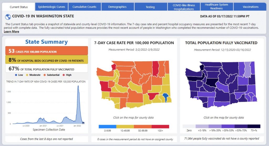
State public health departments built dedicated COVID-19 websites and data dashboards to educate the public and share data on local trends. Some ventures were in partnership with private companies or universities to supplement outdated data systems and lack of resources. Michigan’s online dashboard, MI Safe Start Map, was a partnership between the Michigan Departments of Health and Human Services (MDHHS) and the University of Michigan School of Public Health. Washington State Department of Health partnered with Microsoft’s AI for Health team to build a COVID-19 Data Dashboard that shares daily data updates for the state where many Microsoft employees live and work.
In California, Blue Shield built the Neighborhood Health Dashboard to increase transparency around community health and help address health disparities that were further highlighted by the pandemic. Dashboards use demographic data for race & ethnicity, income, and other factors to help public health departments and communities identify and address inequities. California’s data hub was used to produce a new vulnerability index, which focused on social and economic vulnerability of communities to assist in prioritizing the resources for COVID-19 recovery efforts.
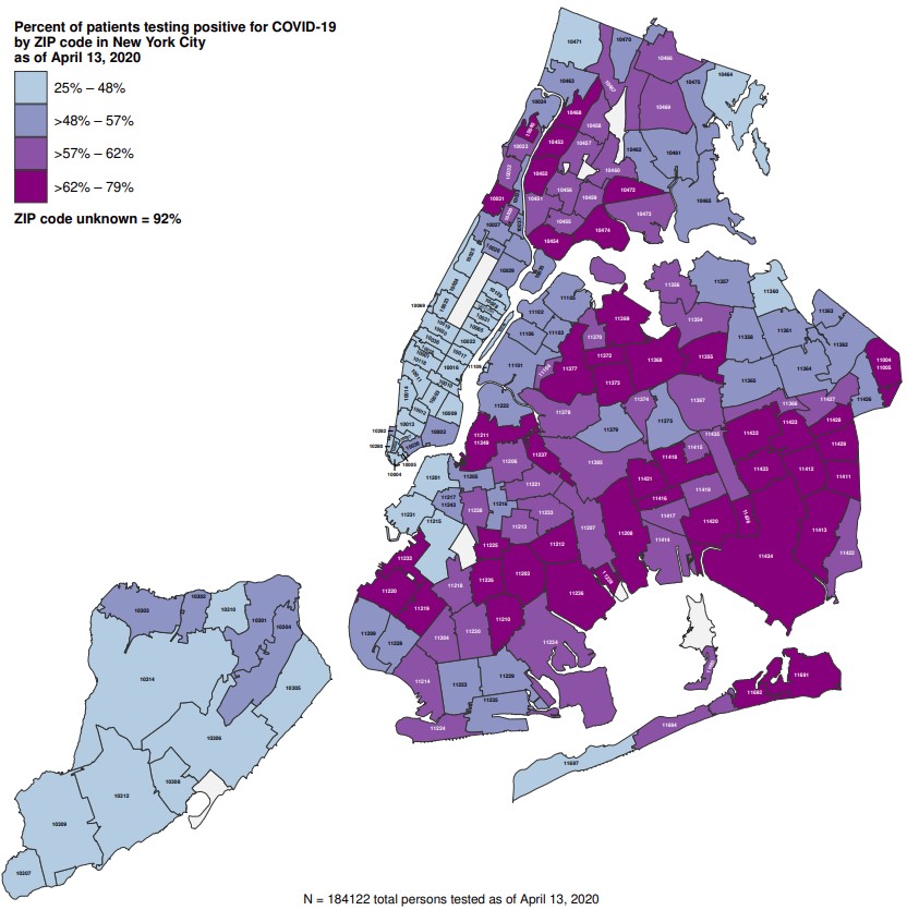
Mapping of local areas is key to understanding how different neighborhoods are impacted by COVID-19. NYC’s neighborhood-level COVID-19 maps in April 2020 from New York City Department of Health and Mental Hygiene helped communities address risk and showed how ongoing technology investments minimize the time needed to build something when it is urgently needed.
New mobile apps were available to report symptoms, help with contract tracing or warn of potential exposure areas. The North Carolina Department of Health and Human Services SlowCOVIDNC app uses location data and notifies a user if they have been in close contact with someone who has shared a positive COVID-19 test result.
These technology innovations helped our understanding of the pandemic’s spread and risk levels, as well as the disparate effect on some communities. Public health departments have an opportunity to use these successes as evidence for increasing investment in digital public health tools. This will help ensure that we are building a systems-level approach that invests in the infrastructure needed to ensure that the pieces are integrated, data is standardized and accessible, and public health agencies are ready for the next crisis.
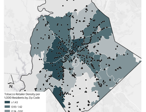
Data gives a strong evidence-base when developing and implementing policy. Mapping data is often a strategic element that helps educate and raise awareness around issues that impact communities. For examples of our work with mapping data, check out our relevant success stories: in Minnesota’s Golden Valley our mapping technology software was used to understand tobacco retailer density and proximity to schools, and in Florida’s Alachua County, we created local area maps to show potential effects of proposed policy changes. To learn more about how we can help reach your policy goals, reach out to us at [email protected].